My Designs:
All designs were created in Adobe InDesign and Photoshop.
Business Flyer
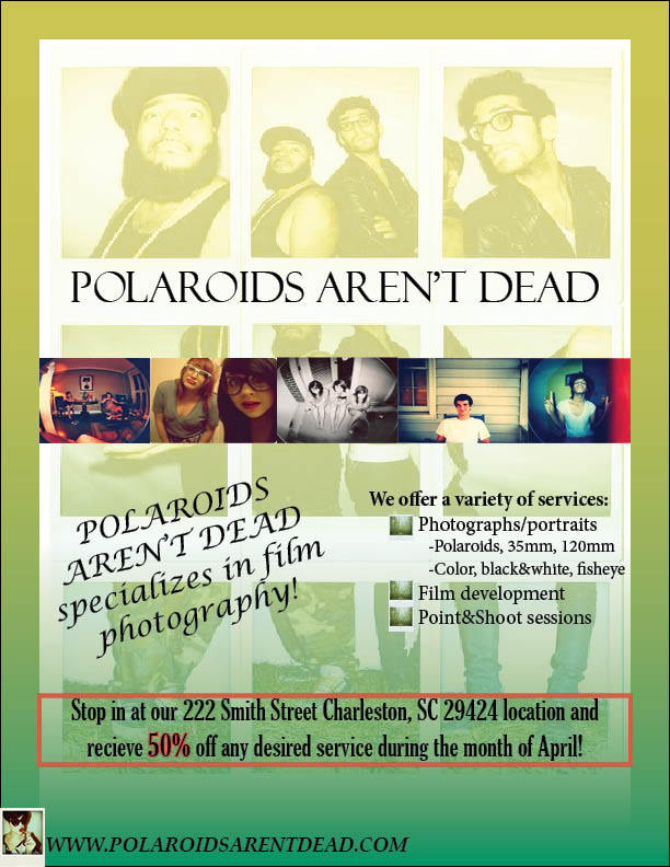
Flyer Justification:
The business displayed in my business flyer is a photography shop, specializing in film photography. In my design, I used the element of contrast by using different fonts, sizes, and colors. I used different colors on certain items and borders to accentuate them and draw attention. The element of alignment is used to not only separate certain words from others, but also to give the flyer as a whole a cohesive and attractive look. The repetition of the company name is used as well as the color scheme to keep everything cohesive as well. I chose to put examples of the types of photographs the company takes in proximity of one another. All of the elements used can be tied together to create my business flyer. The advertisement of my business is attractive in color, content, and alignment. The message displayed appeals to an individual who is interested in photography.
CD Cover
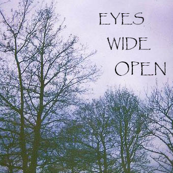
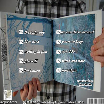
CD Cover Justification:
I chose images that appealed to me in order to create the music CD front and back cover. On the front cover, I chose to align my vertical text the way I did for a nicer look at first glance. I chose the font for the text for the same reason. The black font I used for the text on top of the background image provides a nice contrast and cohesive look in my opinion. I kept it simple on the front because CD’s are all lined up together in stores and the front cover is what is going to attract a person’s eye when glancing at all the different CD’s at once. The cover is simple, yet attractive to the eye. For the back cover, I used branched icons to “bullet” the aligned song name text. The repetition of these icons provides a nice visual appeal and togetherness.
Advertisement

Advertisement Justification:
I chose to use the same basic color scheme for my advertisement. I changed up the fonts and alignment to put more emphasis on certain words. The colors used provide contrast and cohesiveness. The background image draws visible interest to the advertisement. The words are in proximity to each other, yet aligned differently. At first glance of the advertisement, one will see all of the elements at play. It is simple enough to read quickly and focus on each text box separately, yet the elements are seen combined as well. I decided to advertise a cause that is sponsored by a charity willing to donate to the children’s hospital. To me, the layout of the advertisement is simple, yet eye catching and provides all of the information one would need in a organized manner.
Business Logo
Logo Justification:
I chose the Sunhead Solar Power company to make a logo for. A logo must be small and simple. It must look good in color as well as in black and white. Most importantly, however, the logo must represent the company. Logos go on business cards, letterheads, envelopes, newsletters, etc. I decided to create a sun coming up over a horizon. I first envisioned the logo when I read “Sunhead.” I got an idea to create a sun peeking its head up over the horizon and the logo underneath. I used the elements of shape, color, emphasis, and alignment in creating the logo as a whole. The shape of the sun coming over the line of the horizon, emphasis on the sun and the company name along with the alignment of the company name across the horizontal lines above and below it.